Unit Three Documentation
Documentation


Unit Three Exhibition


Don’t Make a Monkey Out of Me, 2023, oil on canvas, MDF, pine wood frame, enamel paint, blue fluorescent acrylic plastic, and chrome mirror screws, 101 x 131.5 x 6.7 cm (framed)

A Pipe Dream, oil on canvas, painted frame, Blue PVC Fuel Hose Pipe, 24 x 32.5 x 5.5 cm (framed), 39.5 x 41 x 5.5 cm (overall)

Going to See a Man About a Dog, oil on canvas, painted frame, 21 x 29.7 cm (A4, unframed) 24 x 32.5 x 5.5 cm (framed)
I deliberately showcased three paintings for the Unit Three exhibition: Going to See a Man About a Dog, Don't Make a Monkey Out of Me, and A Pipe Dream. My specific intent revolved around discerning how these artworks engender a reciprocal discourse, interlinking and encapsulating parallel themes upon their interaction. Within the context of a painting, the coexistence of the present and the past prompts an inquiry into the position of painting within the contemporary interconnected milieu. Notably, there arises a curiosity surrounding the distinctive visual idioms that arise from the integration of modern technology. Ambiguity shrouds the definition of a painting within the current era; ascertaining the defining characteristics that unequivocally place an artwork within the trajectory of a specific epoch in the annals of visual history remains elusive. My deliberate selection of imagery sourced from the domains of photojournalism, akin to the well-regarded brand National Geographic, highlights the complexity of the temporal dimension, which contemporary global visual culture simultaneously delineates through diverse geopolitical realities and unifies through a collective lexicon of digital imagery.

Image credit: Peer Sessions

Figure from the 1804 edition of Della pittura (on painting) by Alberti showing the vanishing point
Moreover, it is pertinent to acknowledge the diminishing significance of factors such as an artwork's geographical provenance or the employed artistic techniques in its conventional classification. Through utilising diverse visual methodologies and the historical painting technique of oil on canvas, I have actively directed my creative endeavour towards contemplating the inherent historical and temporal nature of painting. This exploration centres on challenging our comprehension of images and their efficacy through the application of painting techniques that straddle the boundary between antiquity and modernity. This is further emphasised by an attempt to delineate their contemporary relevance by portraying the fragmented simultaneity engendered by our expansive media network.
Central to my work are perspectival mechanisms drawn from works such as Leon Battista Alberti's seminal treatise, "On Painting," wherein he expounds upon the examination of vanishing points on a grid, and the compositional principle of the rule of thirds, which governs photographic aesthetics. These elements have played a pivotal role in my artistic exploration, where I have delved into utilising perspectival representation in both painting and photography. As previously articulated, this perspective crystallised during a critique within the Peer Sessions group, which revolved around my exhibited painting titled "Fifteen Love." Notably, Peer Sessions remarked upon the capacity of acrylic plastic to multiply horizon lines and form visual triangles, thus enhancing their perception of spatial dimensions. The application of the rule of thirds is evident in my creative process, notably exemplified in the cropping of the source photograph for my artwork "Don't Make a Monkey Out of Me." Furthermore, I accentuated this effect by incorporating a slender piece of acrylic plastic within the composition to disrupt the visual structure, drawing inspiration from practitioners such as Michelangelo Pistoletto, a prominent figure within the Arte Povera movement in Italy. This artistic movement was characterised by its interrogation of the conventional concept of the self-contained, autonomous artist, instead advocating for active utilisation of space, with the audience serving as a catalyst in the artistic discourse.
Don’t Make a Monkey Out of Me, 2023, oil on canvas, MDF, pine wood frame, enamel paint, blue fluorescent acrylic plastic, and chrome mirror screws, 101 x 131.5 x 6.7 cm (framed)

A picture I took standing in front of Michelangelo Pistoletto’s Partitura in nero - E, 2010 - 2012, at Michelangelo Pistoletto: Origins and Consequences exhibited at the Mazzoleni Art gallery
Through the strategic integration of a reflective plastic component, the viewer's own image becomes an integral part of the painting, prompting a contemplation that extends beyond the subject matter and painted surface. This engagement invites a profound consideration of the intricate interplay between the artwork and the viewer's own lived experiences. The manifold challenges inherent in this relationship have significantly influenced the evolution of visual expression, privileging it over verbal articulation within the trajectory of art history. While my artistic pursuit endeavours to imbue images with a more sculptural quality, it necessitates a tighter interweaving of the viewer's spatial realm and the pictorial space. Consequently, the observer continuously reconciles their perception of the painting as a tangible object with their interpretation of the artwork as an amalgamation of narrative fiction and perceptual illusion. A dynamic and mutually enriching relationship emerges between the tangible materiality of the medium and the inherent fictional nature of the represented subject matter. Of particular interest is the viewer's heightened awareness of the physicality of oil on canvas juxtaposed with the simultaneous experience of illusionary replication, where these two facets coexist harmoniously. In the work "Don't Make a Monkey Out of Me," the conventional boundaries between the frame and the painting assume a less distinct delineation, as the presence of reflective plastic renders the painting inseparable from its frame. This transitional disposition serves as an extension of the palpable space, alluding to a realm beyond its material existence.

Close-up of: Don’t Make a Monkey Out of Me, 2023, oil on canvas, MDF, pine wood frame, enamel paint, blue fluorescent acrylic plastic, and chrome mirror screws, 101 x 131.5 x 6.7 cm (framed)
The chrome mirror screws that secure the translucent acrylic plastic, which spans both the painting and the frame, contribute significantly to the polished and factory-like aesthetic. By extension, they underscore the reproducibility inherent in contemporary culture. This ornamental aspect not only provides supplementary framing for individual elements but also effectively positions the work as an installation, occupying an intermediary space between a painting and a sculpture. The artwork elucidates a foundational premise that underpins my artistic exploration, aiming to merge a profound recognition of the pervasive apparitions inherent in every image with the creative potential to apprehend them within the tangible context of media imagery. Each painting is enclosed within substantial frames, effectively embodying the paintings and immersing the actual gallery setting within the visual representation. This immersive experience challenges the audience to contemplate temporal and spatial perspectives as analytical tools for engaging with art. The act of situating the works within the realm of painting was accomplished through an array of deliberate aesthetic choices, with the invocation of the gallery being but one of them.

Front cover of Image-thinking by Mike Bal
Through this investigation, it has become evident that images traverse the realm of embodied experience and circulate within networks, manifesting in a continuous flux characterised by varying velocities. Ultimately, they endure perpetual reproduction and transference, irrespective of the uniqueness of their subjects, whether in the literal or figurative sense. This premise finds resonance in the theory of "image-thinking" put forth by Mieke Bal, a renowned cultural theorist and art historian. "Image-thinking" diverges from the perception of images as static representations devoid of genuine meaning and agency. Instead, it offers a critical analytical perspective emphasising their inherent dynamism and volatility. The subsequent considerations surrounding "image-thinking" unveil how the image stands at the crossroads of our inner and outer worlds. Consequently, it prompts a shift from passive and habitual modes of observation, where the image serves as a conduit for thought and where we no longer perceive ourselves as mere observers before a framed image but, rather, as individuals passing through and beyond it. Rather than merely presenting a predetermined object, the focus lies on formulating an exhibition approach that emphasises viewer engagement, the excitement of inquiry, and the immediacy of the moment. The immediacy of the present moment assumes a profound significance in this context, as it facilitates an in-depth exploration of our mechanisms of engagement with and assimilation of visual information.
In David Joselit’s seminal essay “Painting Beside Itself,” the discourse surrounding contemporary art challenges the notion that painting exists as a self-contained spectacle, emphasising its role as a dynamic entity undergoing continual transformation. Joselit posits that contemporary artworks are not isolated entities but are, instead, interconnected within broader networks that shape their formulation and circulation. The genesis of contemporary painting, according to Joselit, is contingent on the networks to which it belongs, explicitly establishing connections with the production processes, institutional frameworks, art market dynamics, and overarching discourses that define its inception and constitution. Joselit encapsulates this essential disposition of contemporary art with the succinct phrase, “Painting is beside itself” (Joselit, 2009, p.34).

Sara Barker, Conversions, 2011, steel, aluminium, various paints, 215 x 115 x 65 cm
Sara Barker is an artist engaging with the contemporary manifestation of the term ‘transitive’ painting, a concept elucidated by David Joselit. This form of painting operates within the intricate networks that contribute to its emergence and circulation in contemporary art. Barker’s work seamlessly incorporates the expansive domain of the art world, encompassing both tangible and intangible spaces, institutional frameworks, and the commercial sphere. Within her creations, the distinction between the viewer’s engagement with the artist’s semiotic representation and the transformation or translation of the work within the social networks surrounding the contemporary art world becomes indiscernible. Simply put, Joselit, in his essay “Painting Beside Itself”, contends that the materiality and methodologies prioritised by the artist, alongside the spaces affiliated with their endeavours, such as galleries, institutions, and markets, no longer maintain a clear distinction in transmitting the expanding field of contemporary practices. Joselit contends that ‘transitive painting,’ offers a departure from the “enduring critical dead end: the reification trap” (Joselit, 2009, p.132). With painting susceptible to commodification, it tends to solidify specific social relations within a network. Joselit argues that Transitive painting reveals that these networks are not entirely static but open to varied social relations, spatial contexts, and material forms. In the context of “Painting Beside Itself,” this signifies an objective acknowledgement of space within the art world, prompting a reflection on how Sara Barker scrutinises these networks and reflects the essence of ‘transitive painting’ for a more nuanced understanding of the concepts inherent in ‘painting beside itself.’
Barker’s work transcends traditional medium boundaries, occupying a space that defies categorisation. The structures, crafted from aluminium and steel and coated with layers of oil paint, gouache, and watercolour, resemble the lineage of sketches more than traditional sculptures. The negative space within Barker’s artworks extends beyond their materiality, referencing a domain outside their physical existence. These slender frames both inhabit and reach out to spaces, tangible and intangible, demonstrating a high degree of self-reflexivity in painterly practices. While Barker may not explicitly articulate this spatial consciousness as a deliberate response to Joselit’s ideas, it aligns seamlessly with the transitive painting concept, offering a motivated example supporting Joselit’s thesis of Painting Beside Itself. Barker’s work directs the viewer’s attention to social networks, engaging in a dialogue with other works through the passages of transitivity. The spaces between the peripheries of her works add layers, adding more meaning and significance. For Barker, transitivity is linked to the gallery’s negative space, highlighting the interconnectedness of works and the potential for expanded interpretations. By revitalising and redefining the contextual and material basis of painting, incorporating various mediums, and altering spaces of distribution and display, Barker’s network painting exemplifies an ongoing exploration of transitive possibilities and positions. While the medium of painting was previously examined for its contextual and material attributes within the confines of the frame, contemporary inquiry now predominantly occurs at the intersection of the painting’s periphery and the surrounding contextual spaces.
Sara Barker, Conversions, 2011, steel, aluminium, various paints, 215 x 115 x 65 cm
Unlike the self-referentiality prevalent in modern art, where the medium's materiality was scrutinised to establish its pure essence, contemporary painting, influenced by post-modern art discourses, engages in self-reflexivity that visualises its circulation and distribution. Artists since early post-modernism have sought to challenge and reject the values associated with reductive modernist principles. This shift toward self-reflexivity, integral to Joselit’s “network painting” concept, reflects a complex engagement with global realities and their impact on subjectivity within contemporary art. Sara Barker’s work resists reducing painting to semantic signs, choosing instead to address how the dynamics presented by Joselit intersect with or disrupt self-referentiality. Contemporary painting, according to Joselit, expands through internal and external passages, embodying the fundamental importance of subjective reality and self-reflexivity. In essence, contemporary painting becomes an exploration of variable discourses that traverse what Joselit states, “the passages internal to a canvas, and those external to it” (Joselit, 2009, p.129).


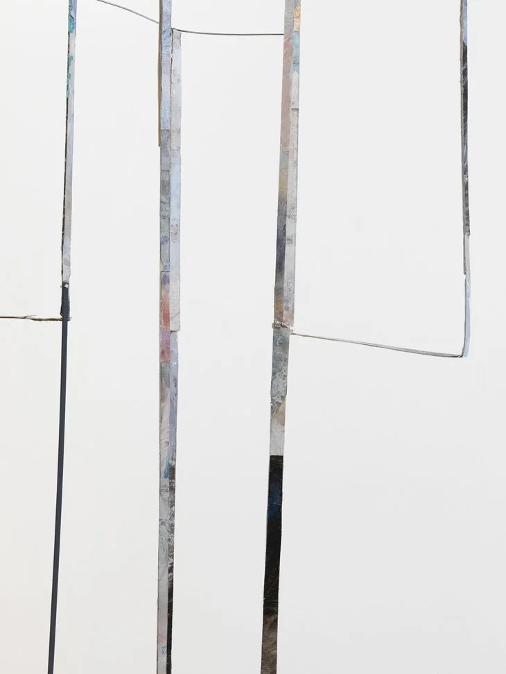
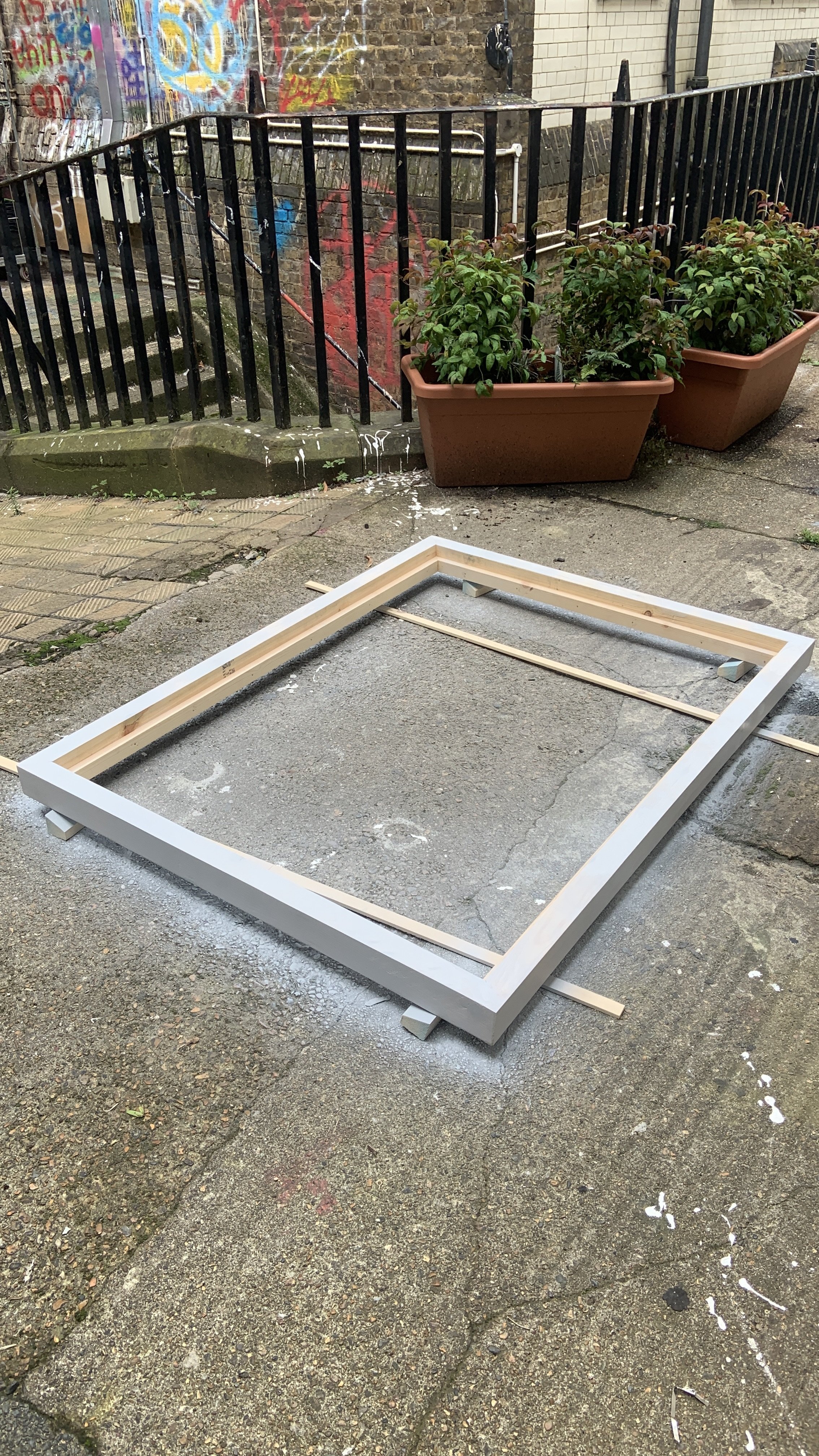
Given the foundational premise of my artistic practice, which centres on the tangible presence of painting through the incorporation of frames and physical extensions that manipulate both virtual and physical spaces, I expanded this inquiry into the realm of framing by introducing a large frame, maintaining the same proportions as my painting "Don't Make a Monkey Out of Me," albeit on a significantly larger scale matching the dimensions of the studio wall at 244cm in height. Employing thematic colours akin to those utilised in the framing of my other paintings, I opted for a vivid hot pink shade, harmonising with and enhancing the interconnected flow of imagery within the curated installation. This intentional approach serves to unify the separate works, fostering a cohesive integration rather than an isolated coexistence, thereby prompting a contemplation not only of the points at which the works converge but also the interstitial spaces in between. By forging connections between the positioning of the artworks, the audience, and the architectural setting, the overarching objective is to prompt a nuanced examination of the dualities inherent in the reception and consumption of visual information. This comprehensive endeavour strives to delve into the intricacies of aesthetic practices and the emergence of implicit subjectivity, as the deliberate utilisation of space necessitates a recalibration of our focus, encouraging a heightened awareness of our surrounding environment. Enabling a holistic engagement invites an active involvement that transcends passivity, urging the viewer to navigate the artworks and consequently absorb new vantage points and perspectives within an immersive perceptual encounter. Furthermore, I deliberated on incorporating multiple frames, envisaging a configuration wherein one frame would assume a vertical orientation against the wall while another would enshroud the former, thereby instilling an additional layer of visual intricacy within the composition. Yet, upon crafting the smaller yellow frame and situating it within the spatial context, I found that its presence overwhelmed the environment, inducing an excessive saturation of colour that detracted from the overarching contemplation of images that constituted my artistic aims.

A picture I took at the V&A Alice in Wonderland exhibition of Sir John Tenniel’s 1871 preparatory drawing for a wood-engraving by Dalziel for Illustrations of the first chapter of Lewis Carroll's Through the Looking Glass Novel
Initially, I encountered uncertainty in determining whether to employ acrylic plastic to the pink frame akin to that utilised in my painting "Don't Make a Monkey Out of Me" or to integrate a sizable piece of pink-coloured mirror to amplify the concept of incorporating the viewer's image. Ultimately, I opted for transparent acrylic plastic in the hope that it would engender a similar reflective effect while simultaneously preserving transparency, thereby enabling an observer to perceive the artwork beyond the frame. This decision prompted consideration of the prospective title "Through the Looking-Glass," drawing inspiration from Lewis Carroll's novel, which is emblematic of a narrative where the character Alice traverses through a mirror into a fantastical and nonsensical world, encapsulating the idea of a transformative journey or altered perspective. Symbolically, the phrase "Through the Looking-Glass" has garnered metaphorical usage, signifying a transformative shift in perspective or an expedition into uncharted territories, often associated with endeavours of exploration, self-discovery, and the pursuit of deeper comprehension. Within literature and art, the recurring motif of mirrors frequently serves as a conduit for conveying themes pertaining to self-perception, the dichotomy of existence, and the blurring of boundaries between reality and illusion. The exploration of mirrors has engendered extensive deliberation within psychology and philosophy, serving as an instrument for contemplative introspection and fostering metaphoric representations of the intricacies inherent in human perception and consciousness. However, in alignment with the thematic approach established in the titling of the other paintings, all designated with English idioms, I ultimately elected to choose the title "In the Pink." This idiomatic expression traditionally signifies a state of robust health, sound condition, or a disposition characterised by contentment and happiness.
This line of inquiry has not only underpinned my exploration of framing mechanisms within the context of the paintings but has also informed the meticulous curation of the gallery space for the unit three exhibition. Central to all these multifaceted practices is the embodiment of the viewer's body, where the concept of "image-thinking" facilitates an interconnectedness that transcends the constraints imposed by various artistic mediums, assuming an ancillary performative role. In the context of framing spatial configurations within the unit three exhibition, my endeavour aimed to establish a symbiotic relationship between the artworks and the audience by framing the space through parallel frames encompassing both the paintings and the participants. Mieke Bal argues that the "traditionally imposed mode of viewing governs the temporality of looking" (Bal, 2022, pg.6) in museums and galleries, highlighting the significance of time as a material component of the exhibition experience in "image-thinking." The inexorable passage of time intricately intertwines with the aesthetic dynamics of representation, becoming inseparable from the interplay of media networks and visual culture. The critical inquiry undertaken in my work centres on the fluid and transitory nature of images, surpassing their conventional portrayal as static representations of still life. This exploration encompasses the tangible manifestation of a perspectival shift achieved through the very structural underpinnings of the artwork, thereby eliciting a profound transformation that has assumed heightened significance in the wake of advancements in AI and NFTs. Hence, through this project, I aspire for my work to stimulate contemplation regarding the profound metamorphosis of images into data transmissions and visual information, compelling us to grapple with the dynamically shifting hierarchies of images within contemporary culture.


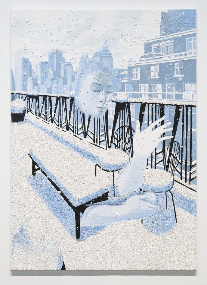
Paint the Town Red, 2023, oil paint, pumice, acrylic gesso, MDF, pine wood frame, and red enamel paint, 101 x 131.5 x 6.7 cm (framed)


In the book titled "Through Touch: Sensuous Theory and Multisensory Media, Laura Marks examines the concept of "haptic visuality" or "haptic touch," exploring the intricate aspects of sensory cognition in the interpretation of artworks. The aforementioned is a conceptual framework that provides insight into the manner in which visual representations might be comprehended, interpreted, and encountered on a physical level. According to Marks, haptic visuality can be described as a perceptual modality that encompasses the simultaneous activation of both the visual and touch sensory systems. The assertion challenges the conventional understanding of vision as solely reliant on the optical senses and instead promotes a broader engagement with visual representations and communication networks that encompasses the physical and sensory aspects. Mark's examples serve as evidence that the significance of haptic visuality in visual art lies in its emphasis on the materiality and sensory qualities of the artwork. The traditional manifestation of visual art commonly prioritises the faculty of vision as the predominant means of apprehension. Nevertheless, the notion of haptic visuality expands the scope of sensory encounters, facilitating a more profound and comprehensive engagement with the artwork. The incorporation of haptic touch enhances the understanding of the artwork by engaging many sensory modalities, therefore fostering a deep connection between the viewer and the artwork.
By integrating Marks' theoretical framework into my artistic methodology, my objective was to foster tactile involvement, prompting the viewer to actively engage in the aesthetic encounter. This methodology facilitates a heightened and corporeal engagement with the artwork whilst encouraging a discerning detachment in our interpretation of media images and visual culture. Marks' theory of haptic visuality has substantially influenced my artistic practice during the unit three exhibition, as it underscores the significance of involving the viewer as an active participant in the artistic encounter. This methodology facilitates a heightened sensory and corporeal engagement with the artwork, concurrently fostering a discerning examination of our cognitive interpretation of media images. The incorporation of tactile elements, such as framing devices, objects, and interactive interfaces of reflective plastics, into the artwork was expected to enhance the haptic qualities and provide a deeper sensory interaction. Nevertheless, I aimed to further augment this endeavour by delving into the tactile attributes of the surface itself, presenting an opportunity to question the inherent two-dimensionality and flattening of photographic reproduction. The coexistence of this disjunction among the elements is observed simultaneously, emphasising the three-dimensional structure of the painting as I adjust spatial and depth aspects, alternating between the two-dimensionality and three-dimensionality of pictorial techniques. In essence, the utilisation of tactile attributes inherent in the medium allows for the creation of a photo painting that encompasses not only the subject matter but also incorporates elements of the photograph or source material from which the image is derived. Maintaining the accessibility of this dual register emphasises the significant presence of the artificial or deceptive nature of painting: the photo paintings do not provide a literal view of reality but rather a calculated intervention in the widespread dissemination of pictures.
Upon perusing my collection of photographs, I observed the diverse chromatic and textural characteristics stemming from the progression of photographic advancements throughout the evolution of photography. By attempting to recreate this grainy photographic effect, I hope that the tactility of the work will enhance the viewer's experience by provoking cognitive self-reflection, sociocultural self-awareness, and aesthetic self-awareness by encouraging the viewer to reflect on the act of touching the work and making it a more tangible and visceral experience. Considering physical contact suggests a state of being apart or exclusive. The phenomenon of a disembodied vision, which is limited to the realm of the optic, serves to convert visual stimuli into cognitive processes associated with perception and understanding. The art historical underpinnings of the correlation between knowledge and vision substantiate and value vision over alternative sensory encounters. The inherent nature of an art object's proxy position is evidently unassailable, while haptic images, as articulated by Laura Marks, do not primarily elicit identification with a figure but rather foster a corporeal connection between the spectator and the image. Therefore, it is more suitable to discuss the dynamic subjectivity between the viewer and the image rather than referring to the object of a haptic gaze. The haptic sensation should not be regarded as a mere supplement to the visual perception but rather as a disruptive element that challenges and goes beyond the boundaries of the optical experience. In order to transgress the boundaries of this revered visual domain, my intention was to produce a piece of art that references the tactile sense to explore a duality in our cognitive and perceptual processes and the manner in which we assimilate information. This would be achieved by incorporating various forms of sensory encounters that elicit a response from the viewer through the medium of texture. For Allison Katz, it was employing the act of dispersing rice over a surface to juxtapose an image's illusionistic qualities with tangible substance. Each individual grain of rice served as a distinct entity, in contrast to the pigment particles that dissolves into the paint medium. The haptic qualities come to the forefront in "Slippy" as the rice grains not only skillfully replicate the illusion of snow on the flat canvas but also infuse the artwork with a tactile quality. This enhancement elevates the viewer's sensory experience, creating an immersive engagement with the virtual pane that extends into the tangible space.
Alison Katz, Slippy, 2017. Acrylic and rice on canvas, 175 x 125 cm. © the artist (2021). Courtesy the artist and The Approach, London.
In the context of photographic paintings, artists might use texture to bridge the gap between the precision of a photograph and the expressive qualities of a painting. Through the integration of the verisimilar elements of photography with the expressive autonomy of painting, practitioners are able to cultivate a unique aesthetic that elicits a multifaceted engagement from the viewer. The incorporation of texture inside a painting contributes to its visual depth and intricacy. The artwork elicits sensory engagement from viewers by deliberately manipulating surface variances, resulting in distinct light reflections. This enhances the visual allure of the artwork and adds a tactile dimension to its appeal. The incorporation of texture in a painting can introduce a tactile dimension despite the inherent two-dimensionality of the medium. Upon perceiving texture, observers may experience an innate inclination to engage with the surface physically, establishing a profound connection between the artwork and its viewers. In photographic paintings, texture can be used to simulate the textures of the tangible objects being depicted, such as the imperfections in photographic prints. The artist uses their own creative freedom and knowledge to create a unique visual language that helps to create a more realistic representation and a sense of tangibility within the artwork. The effect of texture manifests in intriguing manners as it interacts with light, forming highlights and shadows. These visual effects augment the perception of three-dimensionality on a two-dimensional plane. The interaction between light and texture in the painting contributes to the creation of visually dynamic results. Texture can be altered and employed by several techniques, including applying impasto, glazing, scraping, and integrating mixed media components such as sand or marble dust. Through the deliberate placement of contrasting textures, I aim to establish a sense of juxtaposition within the composition, guiding the viewer's focus and engendering a heightened visual dynamism. By engaging in an investigation of texture, I aim to create a platform for experimentation that has the potential to expand the limits of my artistic endeavours. I intend to investigate various materials, processes, and tools in order to generate a diverse range of textures and effects, thereby expanding the limits of my artistic ingenuity.

Experimentation of Textured Grounds to Create a Grainy Photographic Effect.
My intention was to investigate various artistic materials that can alter the surface with textural properties, adhere to the substrate, and facilitate the application of oil paint while guaranteeing long-lasting durability. The issue of adherence is infrequently encountered when applying oils over a wide range of acrylic substrates. Many gels, paints, and mediums frequently demonstrate favourable adhesion characteristics when used in conjunction with most oil paints. Acrylic paint films, regardless of their sheen, generally possess a certain degree of porosity that allows for the adequate infiltration of oil paints, leading to the development of a reasonably strong bond. The adhesion of oils to acrylics is determined primarily by technical considerations, leading to the most effective adhesion when applied to surfaces with a matte and toothy texture. When combined with high-load acrylics, matte acrylics present very suitable surfaces for oil painting applications. Similarly, matte mediums, pumice gels, and moulding paste provide a textured surface suitable as grounds. To improve the adhesion of oil paint on glossy acrylic underpaintings, one may consider the application of a thin coating of Fluid Matte Medium. Gels and mediums employed as substrates exhibit a spectrum of viscosities, ranging from fluid to viscous, enabling painters to modify their acrylic paint systems. The extensive array of diverse gels and mediums available for selection appears perplexing and daunting.

Soft gloss provides a surface that is non-receptive to oil paint adhesion. However, the extra heavy gel matte can be used with dry mediums such as sand and glass beads to create a textured surface suitable for oil paint adhesion.
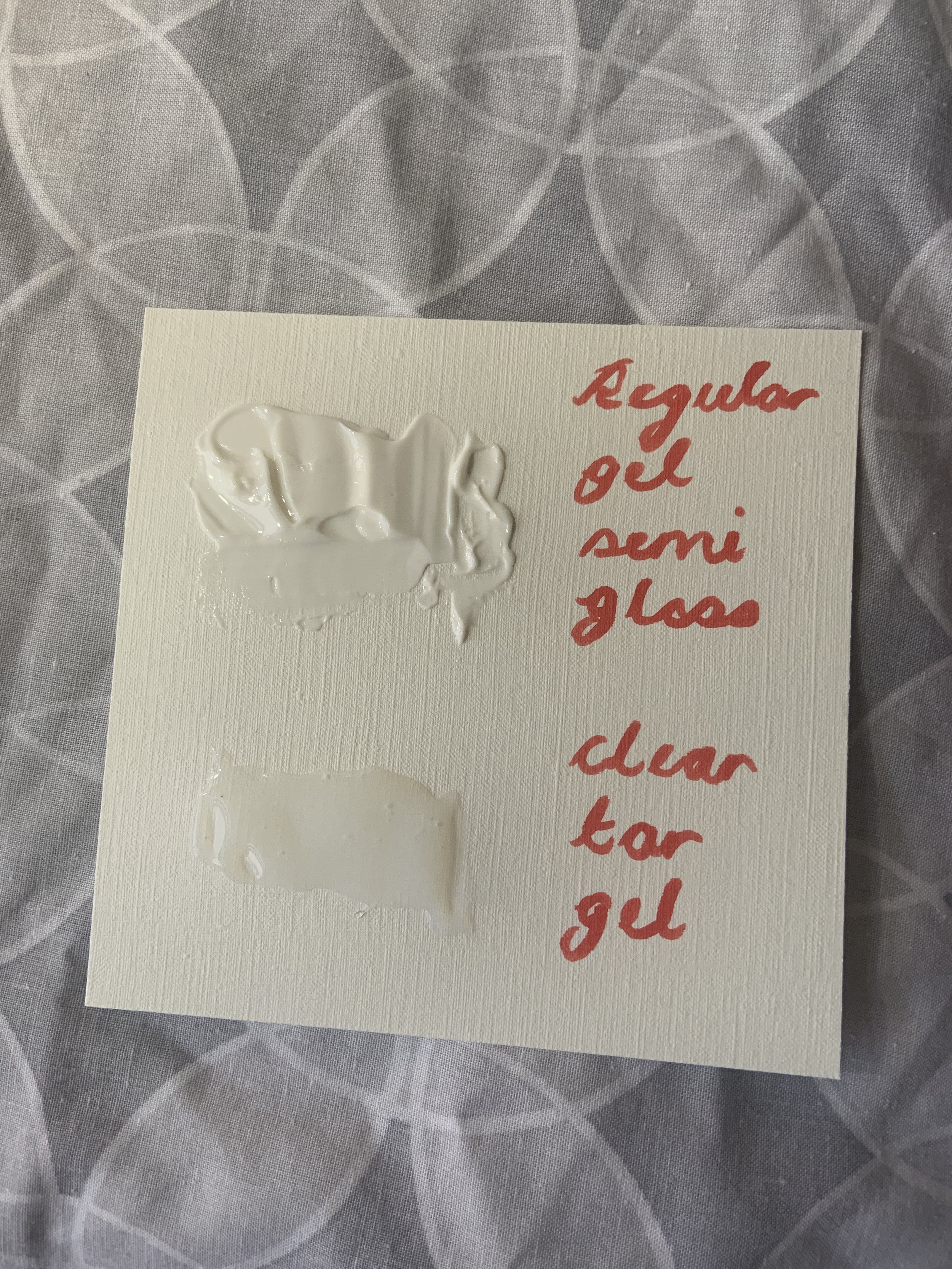
Both regular gel semi-gloss and clear tar gel provide a surface that is non-receptive to oil paint adhesion.
Nevertheless, by possessing a rudimentary comprehension of the diverse range of items accessible and a proclivity for exploration, artists can generate novel modes of self-expression and potentially employ materials in unconventional and unforeseen manners. To achieve the intended aesthetic of a textured surface resembling film grain and fragmented images, I considered combining different acrylic mediums with various materials such as sand, marble dust, and glass beads. The gels and mediums consist of polymers identical to those found in acrylic paints. Essentially, they are the cohesive element that solidifies and transforms into cohesive, resilient coatings. The materials in question consist entirely of acrylic polymers, which have been scientifically demonstrated to possess exceptional properties such as flexibility resistance to various chemicals, water, and UV radiation. By utilising the appropriate acrylic medium or gel in precise proportions, in conjunction with dry mediums, I aimed to effectively establish a ground that exhibits strong adhesion to the support that provides a reliable bond for oil paint. The conventional application of thicker gels involves the creation of relief or three-dimensional effects on the support surface.
In this context, extra-heavy gels, high-gloss gels, and moulding pastes serve as helpful instruments. One common application of gels and mediums is to prime and prepare specific supports. Thicker gels have the potential for utilisation; nonetheless, it is imperative to exercise caution during application to prevent holdout, which refers to the insufficient bonding between the gel and the support material. The use of adequate pressure during the process can effectively address this issue by facilitating the penetration of the gel into the tooth of the support. However, it is crucial to consider the viscosity and its impact on both the adhesion to the support and the evenness of the medium to establish a uniform and appropriate painting surface.
To inquire about the production of textured supports, I opted to experiment with several dry mediums, including sand and glass beads, in combination with diverse gel mediums. Among the many mediums employed in the conducted experiments, the standard gel semi-gloss, clear tar gel, and soft gel gloss demonstrated a notable degree of lustre and a deficit in porosity. This characteristic has the potential to impede the adhesion of oil paint. As a result, I endeavoured to combine the extra-heavy gel matte with a range of dry materials. Additionally, I incorporated premixed mediums, such as coarse pumice gel, into the experimental process.
Pumice Gels
The island of Santorini is characterised by a sedimentary sequence consisting of numerous layers of hardened lava and volcanic ashes, displaying a diverse range of colours. A significant event occurred in 1612 B.C., marked by a colossal volcanic eruption that stands as one of the most notable recorded eruptions in history. A considerable volume of lava, estimated to be thousands to perhaps millions of cubic metres, was forcefully ejected into the atmosphere. Subsequently, the lava descended and enveloped the remnants of the island. Lava cooling as it falls through the atmosphere contributes to the formation of many types of volcanic rocks. Hence, the contemporary composition of topsoil encompasses basalt, volcanic ashes, sand, pumice stone, and various other lava forms. I possess a diverse array of volcanic rock formations from Santorini, which I had intended to integrate into my artistic endeavours. Utilising a traditional pestle and mortar apparatus, I deliberately chose to pulverise the pumice substance and combine it with an extra-heavy gel matte medium. Due to its lightweight and porous nature, I effortlessly ground the pumice material and effectively blended it with the acrylic medium.
Nevertheless, the management of the coarseness of the pumice proved to be a challenging task, leading to the production of a significantly finer granular substance. Consequently, rather than attaining the desired robust texture, the outcome resembled more of a paste-like consistency. After researching the rock and its application as a painting medium, I was excited to learn that Golden sells a premixed pumice gel available in three grades: fine, coarse, and extra coarse. In addition to its capacity for texture manipulation, the product must be supplied with a sufficient quantity of gel medium to ensure a robust adhesion and ample volume to cover expansive surfaces effectively.


The GOLDEN Pumice Gels exhibit suitability in creating granular or pebbled surfaces, whether three-dimensional or flat in nature. In the results of my experiments, I noted that the utilisation of Golden coarse pumice gel led to the creation of a visually appealing and consistently textured surface. Additionally, I discovered that this specific gel had an optimal degree of absorbency, necessitating a substantial quantity of gesso. This characteristic is expected to effectively preserve the painting by establishing a robust connection while facilitating the adherence of oil paint. However, avoiding using surfaces with high absorbency or reducing their absorbent qualities is imperative before oil painting. Surfaces that exhibit a high level of absorbency can withdraw an excessive amount of oil binder from oil paint, leading to an inadequately bound and fragile layer. This condition possesses the capacity to lead to eventual fracturing or peeling. Using acrylic or oil washes on absorbent acrylic grounds is an efficient method for reducing absorbency and enhancing the application of oil paint on the surface. Therefore, applying multiple applications of acrylic gesso to the pumice gel before commencing oil painting is crucial. My primary focus revolved around the possible effectiveness of incorporating a layer of gesso onto the pumice gel as an initial measure before applying oil paint to reduce the likelihood of flaking of the pumice gel and oil paint. However, I was concerned that utilising a layer of gesso might diminish the emphasis on the textured surface. Based on preliminary experimentation, the disparity is seldom noticed. Furthermore, when applied without a gesso layer, the pumice gel can absorb the oil binder in the oil paint excessively, hence rendering the oil paint layer more prone to breaking and deterioration. Despite the favourable textural qualities and apparent efficacy in preservation exhibited by the premixed pumice gel, I remained inclined to explore alternative mediums to attain the most optimal textural outcome, particularly as the pumice gel demonstrated a high cost and provided limited coverage on the surface and multiple mediums can introduce a tactile quality to the paint.

Golden Course Pumice Gel on canvas panel

Golden Course Pumice Gel on canvas panel with oil paint

Golden Course Pumice Gel on canvas panel with gesso

Golden Course Pumice Gel on canvas panel with gesso and oil
Sand/Gravel

In the course of these experiments, I sought to examine the application of sand as a foundational layer for textured painting, utilising red grain along with two different variants of black sand/rock from Santorini, alongside the commercially procured 0.5mm lang lang sand. Notably, the 0.5mm lang lang sand resulted in a texture that exhibited a finer quality compared to the coarser texture achieved with the pumice gel. Optimal results are more attainable by using a substrate with a coarser texture. While the outcomes obtained from utilising the coarse pumice gel were deemed plausible, my curiosity drove me to explore the possibilities presented by coarser sands, seeking options that could potentially surpass the efficacy of the finer 0.5mm lang lang sand.
To address this, I undertook an experiment involving the amalgamation of extra heavy gel matte with a red rock/sand sample collected earlier from a beach in Santorini, Greece, subsequently pulverised using a pestle and mortar. However, the experiment was marred by the notably uneven and rough nature of the self-grinding process, resulting in an inconsistent surface texture. Although it did yield a notably coarse texture, removing the finer grains from the coarser grains posed significant challenges, potentially impeding the even distribution of paint. This observation was particularly pronounced when examining the experiments conducted on the small canvas panels below.

Golden extra heavy gel matte and 0.5mm and red sand on canvas panel

Golden extra heavy gel matte and 0.5mm lang lang sand on canvas panel

Golden extra heavy gel matte and 0.5mm and red sand on canvas panel with gesso

Golden extra heavy gel matte and 0.5mm lang lang sand on canvas panel with gesso

Golden extra heavy gel matte and 0.5mm and red sand on canvas panel with gesso and oil

Golden extra heavy gel matte and 0.5mm lang lang sand on canvas panel with gesso and oil
Support/Canvas Preparation
Upon concluding my series of experiments designed to discern textured surfaces capable of authentically reproducing the photographic grain within a painted image, I decided to employ Golden coarse pumice gel to the support for this painting. The meticulous planning of an artist's support is necessary to create enduring artworks. The preparatory stage serves as a crucial link between the support and the paint system, playing a vital role in the longevity of the artwork. The selection of support, size, priming, and ground is directly influenced by the technique and type of paints employed. In the context of oil painting, it is imperative for artists to apply sizing to their canvases in order to prevent the acidic nature of oil from permeating the support material. Failure to do so may result in the deterioration of the fibres, leading to their eventual decay. In conventional practice, a hide glue, commonly derived from rabbit skin, was directly administered onto canvas or linen to enhance the rigidity of the fabric and safeguard the support from the corrosive properties of acidic oils. At the outset, this process rendered hard and fragile paints such as tempera and oils less prone to cracking. Paradoxically, the introduction of varied temperatures and humidity to the artwork later inadvertently facilitated the occurrence of cracking. Rabbit-skin glue and other glues commonly utilised throughout the "Old Masters" era have hygroscopic properties, indicating their inherent capacity to absorb water. The presence of moisture, typically in the form of elevated humidity levels, leads to the expansion and altered dimensional properties of the adhesive inside this film. Consequently, the film's rigidity diminishes, resulting in the development of cracks and eventual flaking of the paint film. The phenomenon described is primarily observed on canvases made of cotton and linen due to their natural elasticity, which enables the transmission of stress to the oil paint film. Using stiff supports, such as wood panels, significantly reduces the likelihood of swelling. Consequently, rabbit skin glue is deemed more suitable in this case. The solubility of hide glue may pose a challenge when applying a waterborne acrylic gesso, paint, or medium over it, resulting in inadequate film formation and potential detachment from the support. Therefore, it is crucial to refrain from using hide glue as a sizing agent when utilising acrylic grounds, particularly when aiming to create a textured ground. Nevertheless, I have developed a growing awareness regarding the advantages of using acrylic grounds as opposed to animal hides and oil grounds. This shift in perspective is motivated by ethical considerations and the potential for enhanced longevity in paintings, thereby promoting long-term sustainability. It is important to acknowledge the ongoing debate surrounding the use of plastic mediums like acrylic gesso. It's also important to consider the financial viability of my practice when considering the use of acrylic primers, which are more cost-effective compared to animal hides and oil grounds. Additionally, acrylic grounds offer less flexibility, resulting in reduced susceptibility to cracking of oil paint when applied to lightweight and flexible support, thereby mitigating the expenses associated with transportation.

Once the staples and canvas are removed, traces of the rabbit skin glue become visible, necessitating sanding due to its hygroscopic nature.
In terms of minimising long-term movement, rigid panels exhibit superior performance compared to flexible supports such as canvas. Incorporating a backer board or using measures to enhance the rigidity of the canvas may also yield advantageous outcomes for oil paintings executed on pliable substrates. In preparation for this artwork, I had already created a sturdy backing to mitigate any potential displacement, using a canvas that has been tautly affixed to the panel. Preferably, I am inclined towards the toothy and tactile quality of working on canvas. However, it is recommended to utilise rigid supports whenever feasible. Consequently, I chose to affix the canvas onto the panel instead of directly painting on the panel itself. Before I decided to explore alternative methods to create texture, I had initially prepared the canvas panel by applying rabbit skin glue for sizing purposes, followed by the application of traditional gesso (also referred to as oil ground). Additionally, I had already drawn the intended image on the canvas in preparation for the subsequent application of paint. However, I subsequently opted to experiment with a different approach, utilising a textured acrylic ground such as moulding pastes and pumice gel. It is important to note that, as stated, this combination is incompatible with the canvas previously prepared with rabbit skin glue and traditional gesso. Due to this rationale, I decided to extract the staples and detach the canvas from the panel that I had initially primed, as the amalgamation of acrylic medium with assorted dry mediums is expected to yield a satisfactory bond with the support (panel) while also serving as a suitable base for the application of oil paint. Upon extracting the staples and detaching the canvas, it became necessary to engage in the process of sanding the panel. This step was essential due to the persistent roughness resulting from the application of rabbit skin glue. It is worth noting that the solubility of hide glue can pose challenges when applying waterborne acrylic gesso, paint, or medium over the glue. Such an application may lead to inadequate film formation and potential detachment from the support. The inhalation of rabbit skin glue and formaldehyde particles included in MDF can pose significant health risks. To mitigate these hazards, I took precautions by employing a P3 respirator mask equipped with twin filters. This protective measure was implemented using an electric sander to eliminate residual rabbit skin glue adhered to the support material.


To achieve a uniform distribution of the pumice gel across the panel, I positioned the panel in a horizontal orientation and employed a filling blade to disperse the gel onto the panel's surface equally. Nevertheless, spreading the pumice gel proved to be unexpectedly challenging, necessitating protective gloves and manual rubbing to achieve a uniform dispersion across the panel and ensure proper adhesion of the pumice. It's crucial to ensure all acrylic materials are entirely dry and thoroughly cured before applying oil. It is commonly advised to allow a minimum of three days for the drying process of a thin layer of acrylic, while thicker applications may require a longer duration. Additionally, drying rates are contingent on environmental conditions. The primary determinant of the drying rate is air movement, with the additional influence of elevated temperatures and reduced humidity, which can further accelerate this process. After the pumice gel had dried, I smoothed the edges by sanding, ensuring that the painting fit seamlessly within the frame, free from any rough or uneven edges. As we approached the conclusion of the course, I felt slightly apprehensive regarding the limited time left to finish the tasks and fully utilise the studio and its resources. To optimise my time, I enhanced efficiency by applying pumice gel to the canvas and constructing the frame during intervals between the drying stages of the pumice gel and the four layers of acrylic gesso.

Panel with wet pumice gel

Sanding the edges of the panel

Panel with cured pumice gel and four layers of acrylic gesso
By overlaying the image onto this textured surface, I found gratification in the realisation that the coarse texture not only heightened the photographic effects of grain and pixelation inherent in photographic reproduction but also ushered in a realm of creative possibilities. The textural foundation satisfied my aesthetic pursuit and expanded the horizons of my artistic practice, akin to the freedom and expressive potential one experiences when wielding a palette knife. The Golden coarse pumice gel, thus, emerged not merely as a technical choice but as a conduit for enriching the intersection of technique and artistic intuition in my creative journey. Each stroke became a dialogue between the medium's inherent characteristics and my creative intent. Unlike the smooth and controlled strokes that I am akin to on a flat surface, the pumice gel introduces an element of unpredictability and textural richness to the application of paint. Its peaks allow for the creation of bold, impasto textures and expressive strokes, adding a tangible dimensionality to the artwork. This departure from the finesse of a flat surface enabled me to engage with the canvas more dynamically, fostering a visceral and tactile connection with the painting surface.
Furthermore, the pumice gel not only served as a means to manipulate texture but also provided an avenue for the strategic layering of multiple colours commonly encountered in pixelated reproductions. This capacity to layer diverse hues on the surface allowed for a nuanced exploration of the visual complexities inherent in pixelation. The textured surface, coupled with the ability to blend and overlay colours, facilitated the recreation of the intricate and varied tones found in pixelated images. This deliberate layering process became instrumental in achieving a heightened level of fidelity to the characteristics of pixelation, adding depth and richness to the painted representation. The textured surface became a symbiotic method for translating the intricacies of pixelated reproductions onto the painted canvas.


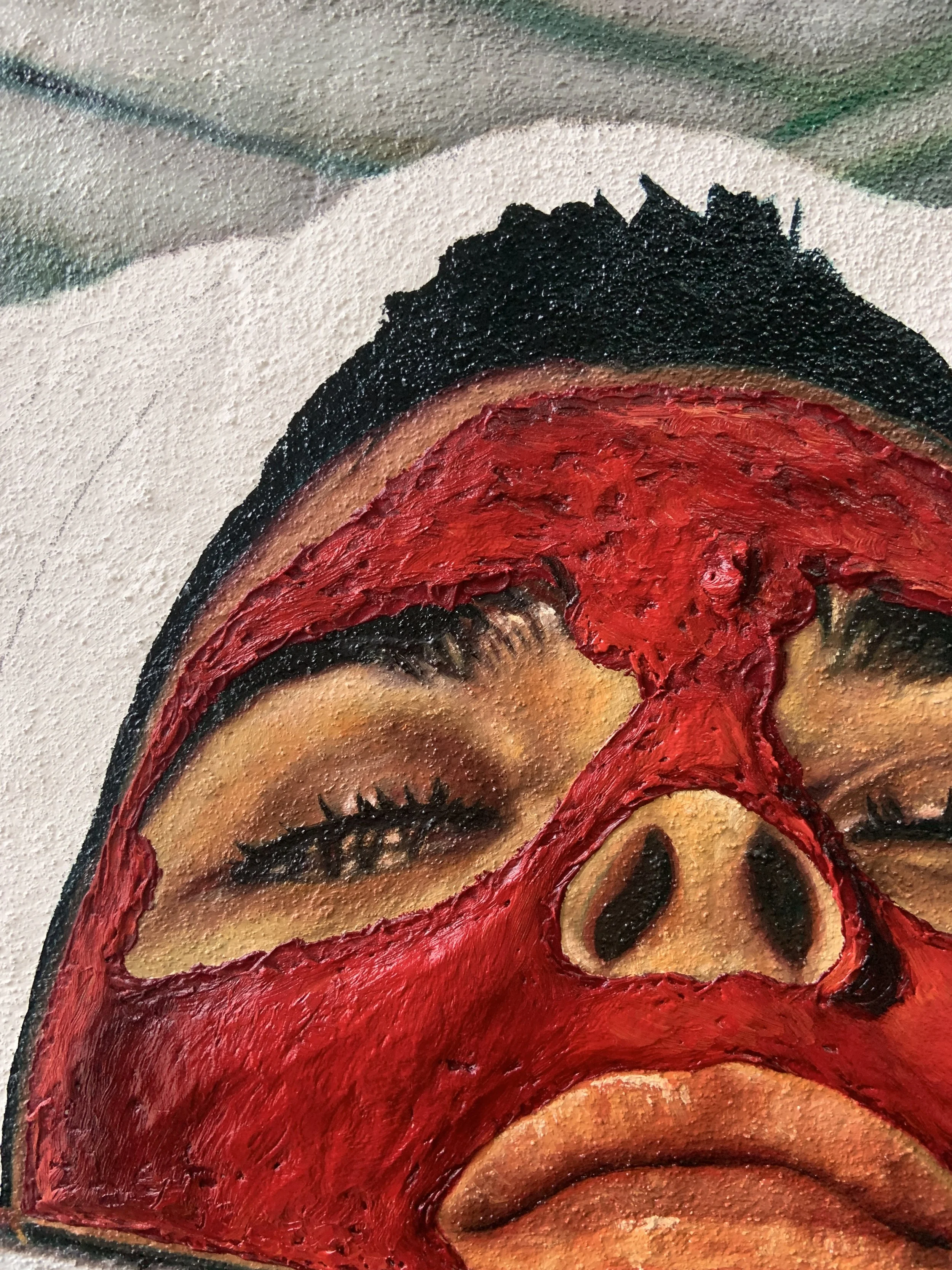
The Face Mask
In addition to the textured surface using pumice gel, I aimed to explore the tactile attributes of the red facial mask depicted in the photograph. Within the presented image portraying a woman actively painting another woman's face, my primary aim was to develop a visually dynamic surface. This goal was realised through a purposeful amalgamation of distinct textures inherent in the facial mask. Moreover, I implemented a strategic approach to applying paint, superimposing it onto the textured surface of the mask. This deliberate technique fostered a dualistic aesthetic marked by juxtaposing contrasting elements with an interplay between the actual textured surface and the illusionism in the nuanced application of paint. By skillfully orchestrating these textures, I endeavoured to establish a sense of contrast within the composition, directing the viewer's focus and fostering heightened visual dynamism. To achieve this, I first conducted an experiment employing various artistic mediums to replicate the tactile qualities of a facial mask, carefully considering the potential interactions between the varied materials utilised in the painting.
Over time, it has been observed that oil paints tend to become increasingly brittle and prone to cracking. Both light moulding and crackle paste, characterised by their soft, spongy, and brittle nature, are unsuitable for providing a stable foundation for oil-based materials. While it is advisable to avoid applying acrylics over oil grounds and oil paints, the reverse, that is, using oil over acrylic, is acceptable. This is because oil paints tend to form cohesive and impermeable coatings that do not bond well when acrylic paints are layered over them.

However, despite these considerations, I found great satisfaction in the light moulding paste's visual appeal and lightweight nature. Consequently, I contemplated the possibility of incorporating acrylic paint into the paste as an alternative technique to achieve the desired colour outcome without relying on oil paint. Although it has been noted that moulding paste possesses a soft and spongy consistency, rendering it unsuitable for use alongside oil, it is crucial to carefully deliberate the potential areas of convergence between these two media and determine the optimal sequence for their application. Specifically, I considered the junctions where the eye, nose, and mouth regions, rendered using oil paint, intersect with the red facial mask that I aimed to replicate using a textured artistic medium. Hence, I recognised the imperative of using this medium before applying oil paints to prevent the moulding paste from experiencing adverse effects such as peeling or cracking.
Moulding Paste
Light Molding Paste enables the creation of substantial layers without significant weight accumulation. When the objective is to expand paint coverage without compromising transparency or specifically to enhance opacity, the addition of Molding Paste proves advantageous. While some products are marketed solely for enhancing paint opacity, Light Molding Paste serves this purpose equally well. It should be noted, however, that including such products may lead to a colour shift towards a lower chroma and possibly a lighter value. However, the outcome was satisfactory since the blue acrylic paint exhibited little to no fading. For the purpose of the experiment, a tube of blue acrylic paint, which I had readily available, was utilised. However, if deemed suitable, the possibility of employing a higher-quality acrylic paint with heavier pigmentation and consistency may have been considered. This alternative may aid in preserving the vibrant colour of the paint when combined with the moulding paste. However, the molding paste with acrylic paint did possess a slightly coarser texture than the fluffy consistency of the medium without acrylic paint. In addition to incorporating the acrylic with the light moulding paste, I conducted an experiment to apply the acrylic paint directly onto the surface of the light moulding paste. This method yielded satisfactory results, albeit with a heightened glossy appearance and a tactile sensation reminiscent of a plastic film. Therefore, if I had chosen to employ the moulding paste, the preferred method would have been to combine acrylic paint with the moulding paste rather than painting directly on top of the moulding paste. It is clear that the Light Molding Paste holds the highest peaks and retains the structure. It is also the best choice when building very thick applications (least weight buildup).


Marble Dust

The alternative approach involved using concentrated oil paint directly extracted from the tube and subsequently blended with marble dust. The effect displayed a pleasing quality, albeit with notably greater density compared to the light molding paste. To comply with the well-known principle of 'fat-over-lean' frequently applied in oil painting, it is essential to employ this substance as a textured surface before using oil paint over the top. Adherence to the fat-over-lean rule is vital when layering multiple coats of paint. This implies that the uppermost layers should contain a higher proportion of oil compared to the layers beneath.
Consequently, adding linseed oil to the paint while applying the top layers can effectively increase the oil content relative to the pigments in the underlying layers. The primary purpose of this practice is to enhance durability and minimise the occurrence of cracking. Therefore, similar to the approach with the light molding paste, when using this technique, it is a requirement to use the marble dust and oil paint medium before applying oil paint on top. Thus, the choice between these mediums primarily hinged on aesthetic considerations regarding the texture's appearance and which method it is believed would offer better preservation.
Oleo impasto medium

Michael Harding’s Oleo Impasto Medium is a gel made from fumed silica and linseed oil, the combination of which imparts great luminosity, particularly with transparent colours. Using the medium in varying amounts combined with neat oil paint achieves extra body. The scepticism of using this medium is that using an extender to oil paint often makes the paint more vulnerable. I was concerned that the heavy oil-based medium would sink, shrivel, and crack over time, particularly if used in large quantities. I had intended to use a large volume of medium to create a prominent texture whilst playing with depth to the surface, so I deemed this medium inappropriate for the desired effect. The result of my experimentation also demonstrated a very glossy gel-like consistency of low viscosity with high transparency. Still, the intention was to create a more fluffy and low-density appearance to simulate the appearance of the mask in the picture I had intended to paint. Furthermore, it induced surface deformation, prompting speculation regarding its susceptibility to wear under the influence of various elements, such as temperature and humidity.
After conducting a comprehensive series of experiments to discern an appropriate textured medium for seamless integration with oil paint, the discernment leaned decisively toward using marble dust. This preference stemmed from its notable compatibility with oil paint and its stability when subjected to overlay, rendering it the optimal medium for the desired effect. The thought process was not solely anchored in practical considerations but was substantiated by a substantial corpus of research affirming the commendable preservation and longevity properties intrinsic to combining marble dust and oil paint. This substantiates the selection, reinforcing the conviction that the chosen medium contributes significantly to the enduring quality of the resultant painting. The dualistic nature of applying paint over this textured medium introduces a nuanced dimension to the creative process. This duality is characterised by the interplay between the tactile granularity of the marble dust and the expressive strokes of paint, engendering a dynamic visual experience. The contrasting elements of texture and paint application synergise to create an intricate dance that elevates the aesthetic depth of the painting.
Moreover, when painting the woman’s face, I noticed an intriguing meta quality that arose in the act of painting a depiction of a woman painting another woman’s face. The intrigue lies in the layered reflexivity and self-awareness inherent in the artistic act of painting. The subject of the painting within the painting, in turn, is portrayed as painting the face of yet another woman. This meta quality introduces a multi-dimensional narrative that creates an intricate interplay between the roles of creator, subject, and the act of creation. The recursive loop of representation invites a self-reflexive dialogue, where I, as the artist, am not merely an external observer but an active participant implicated in the very process of image-making. In essence, the meta quality in this context goes beyond the surface of the painting. It delves into the reflexive and conceptual layers, inviting viewers to contemplate the act of creation, representation, and the intricate interplay between artist and subject. This meta-narrative extends beyond surface aesthetics, delving into conceptual layers that prompt intellectual contemplation of the broader implications of representation and image-making. The surprising incorporation of meta-narrative elements and the meticulous cultivation of textural and haptic qualities within the painting not only shape the aesthetic encounter but also prompt the viewer to actively engage with the artwork on a tangible level. The nuanced textural and haptic qualities, exemplified through the selection of marble dust and its interplay with paint, provide a tactile richness that probes the viewer to explore the artwork beyond mere visual observation. The interplay of textures and the meta-narrative create a dynamic dialogue between the viewer and the artwork, fostering an immersive encounter that extends beyond the immediate visual experience.


Constructing the Frame


To fabricate the frame, two pieces of wood were affixed together using adhesive and nails, resulting in the formation of an L-shaped structure reminiscent of the moulding typically employed for floater frames. Care was taken to ensure that the smaller piece of wood possessed a specific depth, enabling the painting panel to be seamlessly accommodated within the frame. After assembling four lengths of frame moulding, I cut them at an angle to form clean, seamless corners. Then, I used wood glue and dove joins to create the 90-degree edges securely. A considerably large wood knot expelled a substantial amount of wood sap on one side of the wood. Thus, excavating the knot to extract the sap before applying wood filler and sanding was necessary. After this step, any other uneven surfaces were also filled and sanded. Subsequently, a knotting solution was applied to preempt any potential sap leakage from knots that might seep through the paint layers, thereby averting the formation of stained areas. Following the complete drying of the knotting solution, I administered a layer of enamel spray primer, allowing a period exceeding 24 hours before implementing two successive layers of high-gloss red enamel spray paint.
Glass Bead Gel Experiments
In my exploration to create a textured surface for painting, another experiment was worth documenting: experimenting with glass bead gel. During my explorations in creating a textured surface, a pivotal concern arose: the challenge of maintaining a steady outline for the impending painted image. To address this, my ideas involved an initial drawing complemented by applying glass bead gel over the top before the application of paint. The concept was to allow the gel to dry, revealing a clear image underneath that would serve as a foundational layer for subsequent painting. However, my experimentation with Golden glass bead gel yielded an unforeseen obstacle – its glossy surface proved too slick for optimal adherence of oil paint. Subsequently, attempts to remedy this by combining glass beads with a matte acrylic gel also proved futile, as the resultant surface lacked the desired porosity for practical oil paint application. The intended outcome materialised as the glass bead gel successfully facilitated the visibility of the underlying drawing by applying glass beads. Still, the surface was unsuitable for the application of oil paint.

Golden glass bead gel

Golden glass bead gel with a drawing of kettle underneath

Golden extra heavy gel matte and 3mm glass beads on canvas panel with a drawing of kettle underneath

Golden extra heavy gel matte and 3mm glass beads on canvas panel with a drawing of kettle underneath and oil paint over the top

Andy Warhol (1928 - 1987), Shoes, 1980
However, this yielded an intriguing avenue of experimentation: coating glass beads over photographs. This avenue sought to investigate the transformative impact of glass beads on photographic images and the nuanced connotations they might generate. Despite deviating from my initial intentions, a surprising outcome unfolded – the glossy effect imparted by the glass bead gel introduced a glamorous allure to the images, irrespective of their potentially adverse content. This unexpected aesthetic resonance sparked a connection with the artistic lineage of Andy Warhol, particularly his renowned screen printing technique known as "diamond dust." Warhol's innovative incorporation of crushed glass into his prints, producing a shimmering effect, has become synonymous with opulence and glamour. The influence of "diamond dust" extended beyond Warhol, captivating artists such as Damien Hirst and Russel Young. Collectively, these artists navigated themes associated with the prevailing consumer culture of 20th-century America, embedding their works with socio-cultural commentary and reflective depth. While not aligning with the intended trajectory of my practice, the outcomes yielded by this experimentation proved quite interesting.


Work in Progress: Triplets, Probing the Mysteries of a Double Life, oil on stretched canvas, painted frame, 21 x 29.7 cm (A4, unframed) (each, 2 parts), 24 x 32.5 x 5.5 cm (framed) (each, 2 parts)
As specific themes within my practice have gained prominence, novel conceptualisations for new artworks have begun to surface, particularly those that delve into exploring ideas surrounding reflexivity and the temporal dimension. This mock-up of the diptych paintings I intend to paint was inspired in some measure by Giulio Paolini's Young Man Looking at Lorenzo Lotto (1967), a picture of Lorenzo Lotto's Portrait of a Young Man (1505). The mere change in title (itself a subjective convention) inspires a variety of connotations, such as that the original creator was also the first spectator of the work and that the "young man" is both Paolini gazing at a Renaissance portrait and the object of the gaze of the portrayal. By incorporating his own presence in the piece in this way, Paolini plays with the roles of the subjective and objective in pictures and objects of speculation. However, Paolini's interconnectivity strategy helped to restore visibility, allowing the act of looking to be perceived by the spectator once more through a fusion of art and life. In this way, the observer assumes the role of the final author of the work. In similar efforts, I have employed my own image in the work and employed it as a means to allude to relations between the spectator and the work. The title Triplets is problematic since multiple twofold associations lead the spectator to search for the triad elsewhere, outside the picture plane.

Lorenzo Lotto, Young Man, 1505 (left), Giulio Paolini, Young Man Looking at Lorenzo Lotto, 1967 (right)

Alighiero e Boetti, Probing the Mysteries of a Double Life, 1990, (for Parkett 24)

Alighiero e Boetti, Manifesto, 1967
In addition, I gave the work the title "Probing the Mysteries of a Double Life," after a work by Alighiero e Boetti. This is not least because I have been playing with titles, and since Boetti's central use of titles, exemplified through his semiotic works such as Manifesto, demonstrated the arbitrary nature of the connection between language and reality, which is central to structuralist philosophy. But also, because beginning with Ping Pong in 1966 and continuing through Twins in 1968, he doubled himself by inserting an "and" between his first and last names in recognition of his preoccupation with duplication. In his work Twins, Boetti crafted a public persona for himself by sending out a series of postcards with a surrealist image of himself holding hands with himself, not only himself as the double but also the original and the simulacrum. In Boetti's work, the constant exploration of uncharted territory and the adoption of non-traditional modes of cognition are fostered by the performative use of the double and the theatrical.

Alighiero e Boetti, Ping Pong, 1966

Alighiero e Boetti, Twins, 1968
I wanted to extend painting's framework that I have been investigating in the first unit as sculptural objects, enhancing the sense of continuity between the painting and the frame, conveying a sense of exploration and playfulness by investigating subjective experience through colour comparison and juxtaposition. Here, I activated perceptual faculties by adorning each frame with contrasting hues that mirror those of the garments depicted in the paintings, in addition to the playful use of titles and twinhood. In my Unit One feedback, I was asked about the importance of repetition throughout my online platform. Through my investigations of multiplicity, I realise that the continuous duplication of the image illustrates the ubiquity and sheer power of images in society. The contrast in the two frames draws attention to the spatial relationships on the canvas and the singularity in the pair.

Helen Marten, The Almost Horse, Third Moment Profile, Sadie Coles Gallery
Helen Marten's recent exhibition at Sadie Coles Gallery exemplified the distrust of images, with the exhibition accompanying a diptych title The Almost Horse, after the failed attempts to depict a horse creating an inaccessible subject, and the Third Moment Profile, after the tripartite example of hoarseness evident in the exhibition as well as being a more ambiguous metaphorical title that has its roots in the engineering terminology of the works. Throughout the exhibition, the horse is not realised in language, form, or image; rather, "the threat of linear time is suspended, confused, or even violated because the idea horse, almost arbitrary, is resistant to conventional capture and closure." This has become a springboard for my work, not only for the efforts to purposefully disrupt any illusory manifestation of the subject at hand to reveal the treachery of images but also for the playful and semantic use of double and triple signifiers. Much like Helen Marten, I decided to give the work two titles, Triplets and Probing the Mysteries of a Double Life, further heightening the semantic use of the double and opposition within the work. As well as the practical manifestations of the double: two paintings, two frames, two images; the work also alludes to multiple twofold associations: the simulacra and simulation, the original and the reproduction, etc., further breaking the idea of a fixed image, revealing the treachery of images.
“Tautology is always double... Yes, doubling is tautology too... I am I, he is he?”
The paintings should elicit an immediate reaction of opposition centred on a scepticism for representation, as evidenced by the work's double entendre with titles, "Triplets" and (with a nod to Alighiero e Boetti's use of doubling) "Probing the Mysteries of a Double Life." The title's suggestion of tripartite relations complicates the image's mimetic function by prompting the spectator to search for the triad elsewhere, beyond the realm of the picture plane, and insert themselves into the work. Although I am one of triplets, one of the figures depicted, and the artist, I have exploited these unique tripartite facets of the image to demonstrate that visual imagery never consists of a simple relationship between subject and object. Despite efforts to create two identical paintings, the comparison serves as a semantic shift between the original and the simulacrum, revealing that pictures are a representation of aesthetic subjectivity and a non-viable equivalent to the tangible world. Painting and linguistics become mediums for exploring objects of cultural production and the ways in which we negotiate the construction of a subjective self. The two paintings could essentially embody duplexity and opposition—comprising the subjective and the objective, the internal and the external, the real and the fictitious.


Ironically, when advancing my investigations of twinhood and the double, I came across Van Hanos’s exhibition at the Lisson Gallery, Twin, which featured a collection of brand-new paintings with an emphasis on experimental figuration. The artist actively sought to broaden our understanding of figurative painting and its history. This new body of work reveals Hanos's expanded conceptualisation of painting, which frees both his and our perception of allegory and imagery. The conception of the exhibition was conceived from a conversation between Hanos and his twin brother, sharing his preliminary vision of the duplexity: thinking of the trapezoid-like gallery spaces as a pair, as well as making Twin his second exhibition with the Lisson Gallery and an extension of his previous body of work. Focusing on the formation of one image from another, the concept of twin, as opposed to twins, prompts introspections on the self, contradictory to the plurality of the twin.
This facet of the exhibition aroused my interest because it further emphasises how a picture’s trajectory travels through embodied experience while its meaning shifts and adapts in response to cultural and societal factors over time. Thus, the work explores the enigmas of aesthetic practises and the appearance of implicit subjectivity. A good example would be his painting Twins (inspired by Sam Potthoff, 1979), depicting two sets of eyes in a black void. The pitch-black space alludes, both literally and figuratively, to an investigation of the painting's plane as a two-dimensional space in which three-dimensional effects can be created. According to the artist, these eyes represent babies in the womb, with the dark background suggesting a body. The large illustrative motifs of eyes (which could almost be drawn from popular culture and animation) allude to the sense of sight (or lack thereof) deployed in the womb, suggesting that this aims to address a dichotomy in the way we process and consume information by integrating distinct forms of sensory experience.

Andrew Grassie, Car Door 1, Car Door 2, 2020, Tempera on paper on board, 14,8 x 18,8 cm (image) (each, 2 parts), 31,1 x 35,2 x 3 cm (framed) (each, 2 parts)
During Andrew Grassie’s artist talk as part of the Postgraduate Lecture Programme, Andrew spoke of his practice of meticulous egg tempera paintings, spanning his time as a student to his most recent exhibition at Maureen Paley, Studio M. What most excited me about his presentation were the slides that included repeat paintings in twos and threes. Andrew demonstrated that with each work, there were slight differences but that there was something to be gained in the comparison; the repetition of these motifs prompted a close examination, asking the viewer to determine what lies between, thereby involving the viewer in the very process of constructing meaning and coherence from the resulting image. In addition to emphatically illustrating the minor differences, this multiplication serves to highlight the paintings' proclivity for representation and reproduction, which is semiotically charged by the simulacrum of the original. The work challenges notions of art's social function and autonomy by drawing on the artist's tendency to repeat his own works. The replication adds to the experience of the original image, a moment of cognitive self-reflection, and historical and representational self-awareness. It creates a space and time for contemplation of the paintings that is qualitatively distinct from when the original source photograph was taken, despite the fact that such an experience is haunted by the object's trace. At the end of the talk, I asked some questions regarding duplication and whether he sought to critique museums and the practice of art for their surplus aesthetic and economic value. Andrew explained that his work opens different layers of discourse and continues interest in the status of the images that many artists, such as Louise Lawler, have sought. However, he is very interested in this idea of time: the spatial and conceptual constructions in which his images are made.
References:
Joselit, David, OCTOBER 130, Fall 2009, pp. 125–134. October Magazine, Ltd. and Massachusetts Institute of Technology. 2009.
Bal, M 2022, Image-Thinking : Artmaking As Cultural Analysis, Edinburgh University Press, Edinburgh. Available from: ProQuest Ebook Central. [18 September 2023].
Marks, L. U. (2002). Touch: Sensuous Theory and Multisensory Media (NED-New edition). University of Minnesota Press.
Sadie Coles HQ 'Helen Marten: Third Moment Profile - The Almost Horse,' Sadie Coles HQ, Available at: [https://www.sadiecoles.com/exhibitions/908-helen-marten-third-moment-profile-the-almost-horse/press_release_text/] (Accessed: 10 July 2023).